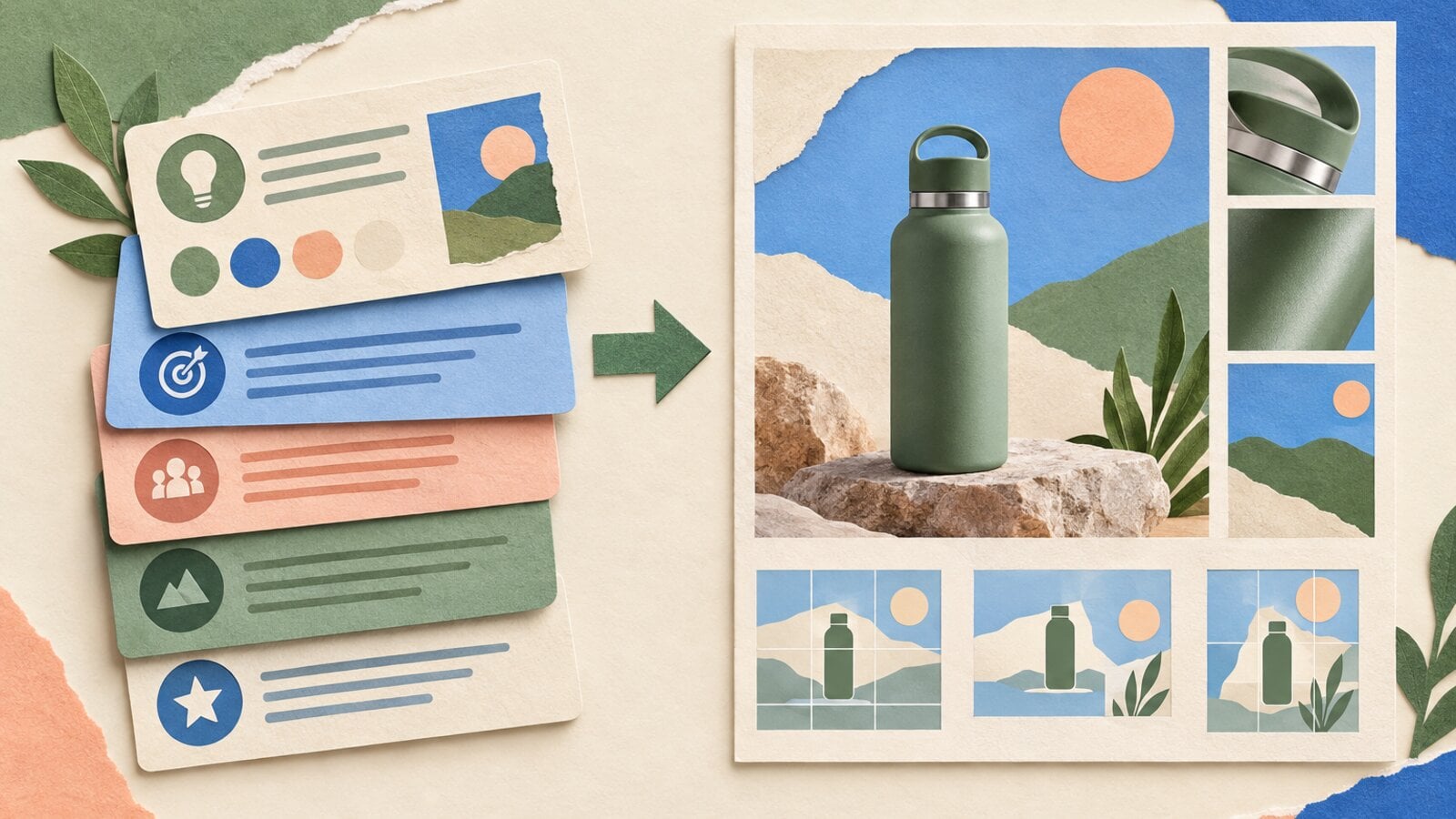
GPT Image 2.5 for slides and presentations
Learn where GPT Image 2.5 improves presentation visuals, how it compares with GPT Image 2, and which slide elements should remain editable.

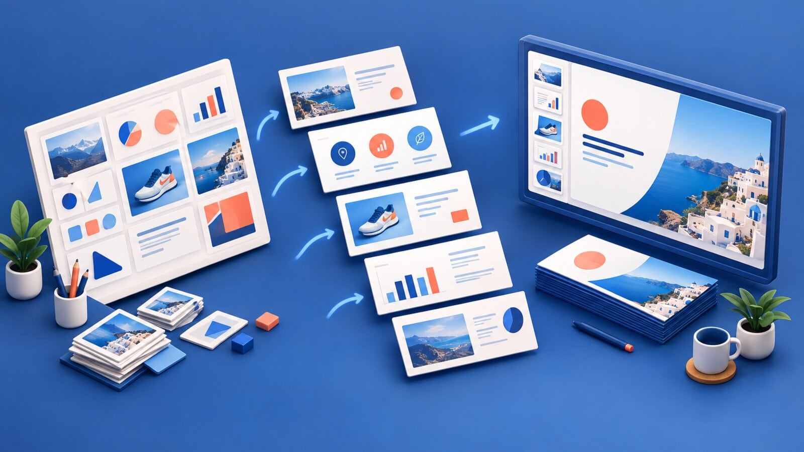
GPT Image 2.5 can create a strong presentation visual, but it should not generate every part of a slide.
Use it for the elements that benefit from visual synthesis: a cover concept, process illustration, product scene, or visual metaphor. Keep the elements that need exact control in your slide tool: data, citations, body copy, page numbers, and anything that must remain editable.
This division gives GPT Image 2.5 a clear job and makes the final deck easier to review.
How GPT Image 2.5 compares with GPT Image 2 for slides
OpenAI positions GPT Image 2.5 Flare as a higher-quality model than GPT Image 2 with up to 50% shorter generation times. The company also highlights stronger reference fidelity, more precise editing, better handling of complex visual instructions, and more accurate real-world content.
Those improvements map well to presentation work:
- Complex layouts: a prompt can specify panels, reading order, hierarchy, and limited labels.
- Reference fidelity: product and subject images can remain more recognizable across variations.
- Focused edits: a team can revise one visual element without rebuilding the whole slide concept.
- Faster iteration: shorter generation times reduce the wait between a brief and a reviewable option.
- Style control: a deck can carry a more consistent visual direction across several generated assets.
OpenAI's launch page also quotes an early Manus evaluation that found Flare delivered high-quality images at two to four times the speed of GPT Image 2. That is a customer statement, not an independent benchmark. The more conservative product claim is OpenAI's own figure of up to 50% shorter generation times.
Performance still depends on prompt complexity, output size, quality setting, and provider load. Treat speed as an iteration benefit, not a fixed guarantee for every slide.
Where GPT Image 2.5 performs well
Presentation covers
A cover needs one clear idea and enough space for a title. The model can combine a visual system, simple text, and a story into one composition.
This original VideoGen prompt turns an ecommerce process into a cover:
A polished 16:9 presentation cover for an ecommerce operations talk.
Deep navy background. One continuous coral line moves through four crisp
isometric scenes: storefront, shopping cart, packing table, and doorstep
delivery. Large exact title "FROM CART TO CUSTOMER" aligned top left.
Small exact subtitle "A simpler path to repeat purchases". Modern editorial
presentation design, strong hierarchy, clean spacing, no logos or extra words.
The concept follows the customer journey from left to right. The prompt limits the text to a title and subtitle, so the model can spend more attention on the visual structure.
Process illustrations
GPT Image 2.5 can create a useful process visual when the number of stages and labels stays small.
A clean 16:9 strategy slide titled "THE THREE-MOMENT CAMPAIGN".
Three equal vertical panels connected by one fine horizontal arrow.
Panel one: a phone discovering a ceramic lamp, labeled exactly "DISCOVER".
Panel two: the lamp on a styled desk, labeled exactly "DECIDE".
Panel three: an open delivery box, labeled exactly "DELIVER".
Warm white background, cobalt accents, subtle paper texture, concise
consulting-deck aesthetic. No extra text, legends, numbers, or decorative icons.
This prompt defines three panels, one reading direction, one repeated product, and three short labels. The output can work as a full visual or as a reference that a designer rebuilds with editable shapes.
Product story slides
A product presentation often needs the same item in several contexts. Reference-led generation can place the product in a new scene while preserving recognizable features.
Start with a clear product image. Then ask for one scene at a time:
Use the attached product as the exact reference for shape, material, color,
and label placement. Create a 16:9 editorial kitchen scene with the product
on the right third, warm morning light, and clear negative space on the left.
Do not alter the product design or add text.
Add the headline and supporting copy in the slide tool. This protects the product image from later text revisions.
Visual metaphors
Strategy presentations often need an image for an abstract idea such as retention, compounding growth, or a shorter purchase path.
Describe the relationship instead of asking for a generic business image:
A 16:9 editorial illustration of one small blue shopping bag entering a
simple circular path and returning as three neatly arranged repeat orders.
Warm white background, dark graphite linework, one cobalt accent, generous
space on the right for a slide title. No text, charts, currency symbols,
people, handshakes, or office scenes.
The image communicates repetition without inventing a chart or data point.
What should remain editable
Do not bake these elements into a generated image when accuracy or reuse matters:
- Financial, scientific, or operational data.
- Detailed charts and tables.
- Citations and source notes.
- Legal text and disclaimers.
- Long titles or paragraph copy.
- Localized text.
- Links and calls to action.
- Page numbers and recurring deck furniture.
Generated visuals are raster images. A perfect label today can become a maintenance problem when the team changes one word tomorrow.
A practical slide workflow
1. Write the slide's claim
Write one sentence that the slide must communicate. If the claim is unclear, a generated image will add decoration without improving the story.
2. Choose the model's role
Decide whether the model should create:
- A complete cover concept.
- A background or hero image.
- A process illustration.
- A visual metaphor.
- A product scene.
- A layout reference to rebuild.
Do not ask for all six at once.
3. Set the canvas first
Generate at 16:9 for a standard widescreen deck. Reserve negative space where native title and body copy will sit.
4. Limit generated text
Use short labels when they are part of the visual idea. Add the rest as native slide text.
5. Review content and geometry
Check:
- Spelling.
- Reading order.
- Repeated objects.
- Product shape and label fidelity.
- Icons that imply the wrong action.
- Visual claims that look like data.
- Space for editable copy.
6. Make focused edits
Protect everything that already works:
Keep the three-panel layout, ceramic lamp, labels, arrow, colors, and spacing
unchanged. Change only the third panel from a closed parcel to an open delivery
box with the lamp visible inside. Do not add text or icons.
7. Add native slide elements
Place title, body copy, data, citations, and brand marks in the presentation file. This keeps the deck accessible and easy to update.
Common failure modes
Too much copy
Long paragraphs compete with the image for attention and increase the chance of text errors. Generate the visual, not the whole document.
Unspecified reading order
A process diagram can become a collage if the prompt does not define left-to-right, top-to-bottom, or radial flow.
Decorative charts
An image model may create a convincing chart that does not represent real data. Ask for an empty chart area or a visual metaphor, then build the chart from verified values.
Mixed visual directions
A request for "minimalist, cinematic, watercolor, photorealistic, playful, corporate" does not define a style. Choose one medium, one lighting approach, and a small palette.
Cropping after generation
A square image cropped into a slide can lose the subject or copy space. Generate for the final ratio.
A reusable slide prompt template
Create a [aspect ratio] visual for a [presentation type] slide.

SLIDE CLAIM:
[One sentence the visual should support.]

PRIMARY VISUAL:
[Subject, process, product, or metaphor.]

COMPOSITION:
[Placement, reading order, panel count, camera view, and negative space.]

VISUAL DIRECTION:
[Medium, lighting, palette, texture, and level of detail.]

EXACT GENERATED TEXT:
[Short title or labels only, quoted exactly.]

KEEP OUT:
[Extra text, logos, invented data, duplicate objects, or unwanted motifs.]
The bottom line
GPT Image 2.5 is a better presentation-image tool than GPT Image 2 when the job needs structured composition, reference fidelity, focused revisions, or faster iteration. It is still an image model, not a presentation editor or source of verified data.
Use it to create the visual idea. Use your slide tool to preserve accuracy, editability, and accessibility.
See the original slide examples on the GPT Image 2.5 model page, copy more structures from the prompting guide, or read the launch guide. Our earlier coming soon announcement provides the first Image Max integration context.
Sources: OpenAI's GPT Image 2.5 announcement and GPT Image 2.5 Flare on fal.